
Look
over there: A Semiotic Analysis between the Public and Private Schools’ Bulletin
Boards and Signs during the pandemic
Introduction
The school has always been a rich source of information and knowledge. The educational space it occupies is overflowing with learning and insights. The bulletin boards and signs posted around a school provide contents that benefit the students, teachers, and visitors. While contents of bulletin boards reflect the progress of the students and the institutions, and provide updates and announcements, signs also serve as reminders and directives.
Weston (2020) quoted that “bulletin boards make learning visible by communicating and creating values about teaching and learning by making individual thinking available to the group and support collective knowledge-building and helping learners to make connections across units and subject matter. Further, bulletin boards provide opportunities to connect learning experiences across classrooms or time. Here, the role of bulletin boards is to make students’ learning visible”.
In addition, the images used also help viewers understand the message better. In fact, Fardows, Nayer, Jaffar and Mariam (2017) emphasized that “generally people preserve information more quickly with the help of images. Those people who work in offices use images to give presentations. Images enhance the level of understanding to a great extent”.
However, because of the ongoing pandemic, the normal teaching-learning set-up changed to blended and modular modalities. Both the public and the private institutions were challenged to adapt to the new normal. These changes also affected the contents of bulletin boards and signs, and how they are constructed to convey meanings.
In La Union, schools have kept their bulletin boards and signages up to date despite having no students inside the campuses during the pandemic. Noticeably, the language, presentation, materials used, and content of these resources vary based on the type of institution.
Thus, I conducted a semiotic landscape analysis on these contents by visiting three institutions in the City of San Fernando: one secondary public school in the center of the city, one public integrated school in a far-flung barangay, and one private school.
Theoretical Framework
To understand how the semiotic resources will be analyzed, I used two approaches in the study namely the Linguistic Landscape in the study of Eclipse and Tenedero (2018) and the Social Semiotics of Kress (2010). According to Thurlow and Jaworski (2010), “apart from indexing a particular linguistic community, the act of displaying a language especially on official, central or local government signage, carries the important symbolic function of increasing its value and status. Thus, the presence and dominance of one language over others may indicate the relative demographic and institutional power of an ethnolinguistic group over the others”. There are three languages involved in the signages that were collected. This approached helped in the study of the dominant language and its implication to the linguistic community and space.
In connection with analyzing images and texts, Kress (2010) posited that “writing and image and color lend themselves to doing different kinds of semiotic work; each has its distinct potentials for meaning – and, in this case, image may just have the edge over writing… Multimodality can tell us what modes are used”. Moreover, Kress (2010) added that to deal with the meaning of the images, “in all its appearances, in all social occasions and in all cultural sites” Social Semiotics is the answer. Hence, I studied the languages involved, the materials used, and the meaning and influences of the images and text used in the bulletin boards and signages.
Methodology
I went to three (3) institutions to collect the 12 images I needed for the study. These schools are La Union National High School which is in the central area and is the largest public high school in the city, Pagudpud Integrated School which is in a barangay far from the central area, and BHC Educational Institution Inc. which is a private school and is in the biggest barangay in the city. Through the approval of Dr. Aileen Salonga, I sent communication letters to the school principals. These institutions and the images were purposively selected. I chose pictures of bulletin boards and signages used within the campuses. I adopted the approach used in the study of Eclipse and Tenedero (2018) but is only limited on determining the dominant language in the selected spaces. Also, I used descriptive qualitative approach for the analysis of data.
Analysis
First, let us look at the languages used in these images from these three institutions. Here, the macro-linguistic framework focused on identifying the dominant language was followed.
Table
1. Languages used in the signages of the selected public and private schools
|
Language |
N |
% |
|
English |
7 |
58.33 |
|
Filipino |
2 |
16.67 |
|
English-Filipino |
2 |
16.67 |
|
Iloko |
1 |
8.33 |
|
Total |
12 |
100.00 |
Table 1 shows the languages used in the signages and bulletin boards in selected public and private schools. As shown, English dominates the space of these schools with 58.33% of signs written in English. This implies how English greatly influence the modes of communication both in the private and public-school environments. In fact, Eclipse and Tenedero (2018) cited Finzel (2012) that “in some cases of LL, minority (or minoritized) languages are given emphasis, while others mirror the growing impact of English as the primary language of globalization”.

Figure 1
Figure 1 shows a signage with three languages. Among all the collected images, this is the only image I got with an Iloko word. This image came from the small public school far from the city central area. As shown, it has English and Filipino translations of the message that the semiotic resource is conveying. When I asked the principal about this, she mentioned the mother tongue-based curriculum of the basic education program of the public school system. This makes sense since most of their stakeholders or clients are Iloko-speakers and having a familiar language makes the space safer for these speech members. Looking at the design, the texts were printed big and in a color that stands out. It is readable, but also very simple. While this is printed, it lacks any graphic designs except for the box that served as the frame of the texts. The material used in bond paper and is covered with masking tape so that it will last longer. We can associate it with its permanency. The signage is temporary and may be replaced once the needed materials are already brought. Another issue present and is a vital reality is the possibility of a lack of funding for some materials needed in a school. Most of the time, teachers have to spend their own money to buy materials in beautifying the classrooms and school buildings.

Figure 2
Figures 2 and 3 present a content of a school bulletin board and a signage respectively. Both used a combination of English and Filipino. For Figure 2, since there is no direct translation of the phrase “social distancing”, the exact words were used in this publication material despite the dominant Filipino language in it. This shows how versatile Filipinos can be as encoders and decoders of messages. Notice also that there were images used in this layout to present a point of comparison for the distance needed for social distancing. The images are the simple events and things that viewers can remember faster and easier. There is also a use of complementary color for the shade of blue and orange. The dark blue background helps in highlighting the important content of the material. This image is strongly influenced by the pandemic situation. But what does this imply on the part of a school? Certainly, this shows that the school is not only aware of current events, but also concern with the health and well-being of the members of the community. The bottom part of the content also has a reference. Aside from the element of immediacy, there is also credibility and reliability. This image, taken from a private school, shows also a skill set. The poster is well-made, and the layout is also clean and balance. This layout was also posted in the school publication Facebook page of the institution to reach more people within and outside the community of its learners. While the material used is bond paper, it was placed in the bulletin board with a glass protection. This suggests that in a private institution the budget was allocated properly to invest in school facilities and materials.

Figure 3
On the other hand, Figure 3 used the word “reminder” despite the existence of the direct translation “paalala”. This indicates that some Filipinos are comfortable already in mixing codes regardless of the speech space. I have also noticed that it was also printed on a bond paper, but it was also very simple. There is no graphical element or layout technique applied in this signage. Because of the presence of the word “bata” and how it was used in the sentence, the message of the post is intended for the children’s parents or guardians. The font size is enough to be read by parents and guardians, but this is visually plain. Like Figure 1, there is an issue on permanency because of the material used in this signage.
 Figure 4
Figure 5
Figures 4 and 5 exhibits the complete use of the Filipino language. These semiotic resources are from the two public schools. This implies that majority of the stakeholders, learners and visitors of these institutions are Filipino speakers. Figure 4 shows a traditional presentation of signage in which red paint is used to write text on plywood. However, because of its simplicity, the signage is also confusing. When looking at the picture, there is no other clues aside from the faucet. The instruction, without prior experiences, remains vague because of the absence of illustrations and arrows. When I first read it, I even asked myself “ang alin?” pertaining to what I cannot drink. Noticeably, the use of informal term such as “pwedeng” is also evident. Simplifying the terms might also help the younger readers to understand the message of the signage.
Figure 5 shares a helpful message in relation to covid-19. The images and the descriptions also help viewers and decoders understand the message faster and easier. The material used here is different from the previous bond papers mentioned since it is a tarpaulin. For its layout, I noticed that some panels are too crowded. There is also a disconnect on the continuity of the characters used in every panel. On the last two panels, notice that the red color always signals "caution" while the green color indicates "go". Was this printed from the internet or was it donated by the government offices? These are the questions that occurred to me when I saw the logos of government offices included on the bottom part of the materials especially that these indicate ownership of the ideas and craftmanship.

Figure 6

Figure 7

Figure 8
Figures 6, 7 and 8 all used the English language. Note that these signages and bulletin board contents are all from a private school. This implies that English widely used in the campus by all the members of the institution including the learners, teaching and non-teaching staff and other stakeholders such as the parents and guardians.
In Figure 6, the materials used include bond papers, color papers, and pins. The arrangement of the papers is done properly and neatly. There is also ownership in the bulletin board since the logo and name of the institution is included. On the lower left corner, there is a diagram showing the modality the institution is using. Green as a color is soothing in the eyes and so the graphic designs look well-made. The other contents are not also overpowering each other.
Figures 7 and 8 are both covid-19 related contents. This signifies that the pandemic affected the consciousness of the bulletin boards and signages as it becomes the central content of these materials. In Figure 7, the phrase “No mask, No entry” is in red which indicates a cautionary feeling. An image was also used to show the mask that should be worn. This supports the message of the signage which makes it more memorable especially for visual learners. However, as seen, it is printed on a bond paper. This can be associated again to permanency which means that this kind of signage will not be here forever in relation to the ongoing spread of the virus.
Figure 8 communicates the IATF health protocols that everyone must follow during the pandemic. Aside from the presence of texts, clip arts were also used to support the content. The main ideas are bigger in font size compared to the explanation texts. This clearly follows the principle in layouting since the emphasis of information is applied on the right places. The images are in altering manner to avoid tombstoning. This posits that the creator of this content is familiar with the rules in layout. The command of the English language is also evident.

Figure 9

Figure 10
Figures 9 and 10 also used the English language. Both also used the same labelling for the files they posted on the boards. Note that these images are taken from the two public schools and this similarity can be associated to the instructions cascaded from the division office. Notice that Figure 10 is more crowded. This is related to its population as the biggest public school in the city. There are more profiles and statistics to deal with compared to a smaller public school. Nonetheless, both bulletin boards were organized and clean. The element of formality is also portrayed in the bulletin boards. Unlike student activity boards or club bulletin boards, this type has more seriousness in presentation and content. These board are also located near the office of the administrators which signify that they have control of the information being announced.

Figure 11
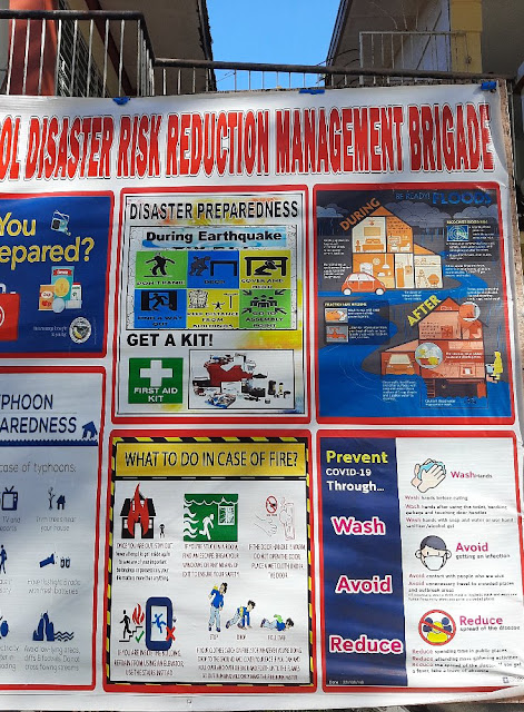
Figure 12
Figures 11 and 12 also contain the English language. The infographics used in Figure 11 is like the topics we have discussed on multimodality and resemiotization in which the text is accompanied with the image that presents the visual action of the content. It is also organized and easily understood. The “x” marks about the faucets indicate also that they cannot use these so that they will observe the proper physical distancing when two people wash their hands on this area. The signages are simple but the letters are very readable. Compared to the previous to-do contents I analyzed, the “Wash Your Hands” infographics has shown the continuity element of characters used in the poster. However, I find the texts in steps 1, 2, 4 and 5 disturbing since they are only words which sound robotic as an instruction. The use of paper towel is also misguiding since there is none in the area.
Meanwhile, Figure 12 presents a collection of infographics about risk reduction management. This post is a tarpaulin so it will last longer than those on bond papers. However, the graphics used are too overwhelming and congested. Despite having the red framing as somewhat a connecting theme, the graphics still looked disorganized. There is no focal point that makes reading or viewing easier and more understandable. Notice also that the descriptive texts are also unreadable because of the size. Another thing I noticed is the presence of a covid-19 related content. This is an alienated content since the rest have a unifying topic. The procedures presented were also confusing since the images used have no continuity element and numbers could have helped in the presentation of the process.
Conclusion
This study revealed that English is the dominant language used in the bulletin boards and signs of schools both private and public. Aside from the information and announcements, many images are Covid-19 related topics. This also indicates how the pandemic affected the educational sector and how it reshaped the “normal” system we had. While code-mixing was present in some images, the use of the vernacular language was the least evident. Most materials used were either bond paper or tarpaulin. When it comes to permanency, the signages and posters made of tarpaulins are expected to be used longer. In terms of layout and design, the contents from the private school showed more potential compared to those I collected from the public schools. This reflects both creativity and technological skills.
The bulletin boards promote transparency especially on the performance growth of learners and the institution. They also serve as extensions of the teaching-learning process. Surprisingly, the analysis showed opposite results to the notion of Backhaus (2006 as cited by Jaworkski and Thurlow, 2010) where private signs have more diversity of languages.
While Filipino is our national language, the official one used within the academes is English. We look over here and there and see signages and bulletin board contents. We benefit and learn from them before and during the pandemic. But the most challenging narrative lies within our realization that these semiotic resources reflect so much of our role in the linguistic community we belong in. Look over there!
References
Eclipse, A. and Tenedero, P. (2018). The linguistic landscape of Manila Central Post Office: a macro-linguistic analysis. Asian Journal of English Language Studies (AJELS), 6.
Fardows, N., Nayer, S., Jaffar, S and Mariam R. (2017). Impact of semiotic analysis of images on students: a case study of images published in Time Magazine, Asia. The International Academic Forum.
Iedema, Rick. (2003). Multimodality, resemiotization: extending the analysis of discourse as multi-semiotic practice. Visual Communication.
Jaworski, A. and Thurlow, C. (2010). Introducing semiotic landscapes. In Semiotic landscapes: Language, image, space.
Kress, G. (2010). Where meaning is the issue. In Multimodality: A social semiotic approach to contemporary communication.
Weston, D. (2020). What is the purpose of bulletin board. The Elementary Teachers’ Federation of Ontario.


Comments
Post a Comment